Thursday, 14 April 2011
What have I learnt?
From this project I have learnt that personal branding is very important, whether you're a freelance designer of post-graduate searching for a job. The brand and colour scheme will stay with you throughout your work, giving the employer or client a good idea of the quality and perhaps style of work which you can complete. The portfolio will stay with me along with the logo and CV, in which I can add to as I continue to learn new skills. Colour scheme and font is important to display the information clearly and easily to read and to grab the users attention.
final website...
The website was created using Flash by a member of our group after all of the planning had been completed. The website turned out really well and gives clear information about the students, university, course, and echibition. It looks very similar to the london underground tube train website which was planned. Here is a screenshot of the home page...

Here are the shots of the various other pages throughout the site. The students page is very good as it features hover buttons, which display information when the cursor is hovered over them. Select each student and it directs you to each individual student's profile page. Which displays the work a brief bio. Here is a screenshot of this page...


As far as Aesthetics goes this website is very good. It is similar to the tube website so looks very proffesional which was planned from the start. The bright background and font colour work well together to provide a clear and easy to read website. It is easy to navigate and understand due to the menu bar at the top. The grapics and high quality photos work really well and help with the professional feel.
Final work for self branding project...
Here is the final work for the self branding project...
The logo...

The business card...

The CV...

The portfolio front page...

As you can see all of the pieces of work are following a certain theme, by featuring the same palette of colours and the same font and logo. I think this has given me a professional look as the colours work well together, but are not over the top. I have put alot of hard work into it and I believe it shows, and shows the amount of effort I'm prepared to put in for a client. It also gives the client a good idea of the standard of work which I may produce. I really like the dark coloured background and lighter shade of font. The only downside could be if I emailed my CV to a potential employer, they may have trouble printing it out as it is dark and will use alot of ink.
This asside though, I am extremely happy with my personal branding project and how it turned out. I will be using these documents in my hunt for employment when university is over.
Pages for portfolio...
Now I had a front page and info page template, I could begin to add work samples. I started with university work and then went on to inlcuded personal work which I have completed over th last few years.
The first page displays an animation, but I wanted to think of a nice way to show this. I decided to put the various screenshots on a computer monitor to show that they can be veiwed on this. When it comes to creating my online portfolio I can inlcuded it as a video. I left a space on the left hand side so it can be bound.

Here are the remaining pages which I have completed...


Portfolio front page...
I had to think about the front page of the portfolio. This is important as it is the first page that people will see and give the first impression.
I came up with a few designs concepts on Adobe Photoshop..


I like both designs and how they sit at an angle to the page. This is in-keeping with my theme throughout my work and I believe it makes it stand out compared to others.
The second design features the graphic i have included on my other work, but I think this makes the page to busy as I'm trying to keep the work minimalist style. I also think a darker colour would work aswell to make it look a bit more high quality and again, match the business card. I redesigned it again and I'm happy with the final product...

Wednesday, 13 April 2011
Creating the portfolio...
Creating a portfolio is also in the brief. Its always a really good idea of showing a potential business partner or interveiwer what you can do. By showing them your own real life work, they can see what level you are at, what you enjoy doing, and what your strengths are. I am lucky enough to have saved alot of my university and personal work to put in my portfolio and I believe the quality of work included is quite high.
Now I had to think of a way to display it. I quickly sketched up some designs that fit in well with my personal branding and scheme. I like the 2 coloured lines and single white line that were visible in my logo. This could be a theme that could run throughout my portfolio.
Firstly I sketched a few ideas out to see which looked good and which concept worked well with my exsiting theme.
I decided on this design as it is simple and fresh. I have kept the theme running throughout the personal branding work and it is not so busy that it distracts the veiwer from the actual work displayed. I will do some pages in white and some in black, depending on the work that is being displayed.
Here is the template I mocked up on Adobe Photoshop that I can use each time I create a page...

I have decided to use the 2 lines running down the middle then shooting off at an angle. I did this to add a splash of colour to the page to fit in with the theme. the lines act as an underline between the title, brief and analysis of the work. The line then angles off into the middle of the page which the users eyes should follow to see the work.
The work number is the largest writing on the page, this is to indentify the work. Next to this is the work title, client and programmes used. This is all the important information right at the top.
New graphic...
The new graphic i used consisted of several images that have been manipulated onAdobe Photoshop. I started by collecting a generic image of a pen, a pencil, an SLR camera, a computer screen and a mouse. These are all implements that I use and will use during my profession. I did this as it helps to give the customer an insight into what exactly it is that I do. Once I had arranged them in a cascading effect, I adjusted the saturation to 0, turned the brightness up and the contrast down, this is how I achieved the silhouette style finish...


Redesign of CV...
I needed to redesign my CV so that its inkeeping with the new theme. I liked to layout of the old CV but the colour scheme was now not matching. I added the new theme graphics and changed the colour scheme and this is what the final concept looks like...


Tuesday, 12 April 2011
Redesign of the business card and CV...
I decided to redesign my business card as I was not 100% happy with the final outcome. It looked good, but as a designer I believe it wasn't giving the right message across. Here is the final business card i came up with...

The card doesn't really give the message across that shows I'm a talented designer. I decided to use more neutral colours throughout my self branding documents. The colours used give a more high quality feel to the card and it also works well with the darker background colour to stand out and become easily identifiable. I decided to use an image theme which described completely what I am about and what I do. Here is the redesigned card...

Now I have a new theme and colour scheme I can begin to redesign my CV and portfolio.
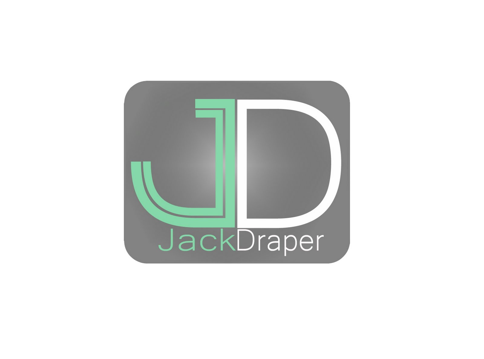
The logo was also changed up aswell to suit the new theme. I keep the font the same (Eurostile) As it look very professional and clear, but I added a white curve at the top to attract the attention of the user as much as possible. Here is the logo featuring the new colour scheme...


The card doesn't really give the message across that shows I'm a talented designer. I decided to use more neutral colours throughout my self branding documents. The colours used give a more high quality feel to the card and it also works well with the darker background colour to stand out and become easily identifiable. I decided to use an image theme which described completely what I am about and what I do. Here is the redesigned card...

Now I have a new theme and colour scheme I can begin to redesign my CV and portfolio.
The logo was also changed up aswell to suit the new theme. I keep the font the same (Eurostile) As it look very professional and clear, but I added a white curve at the top to attract the attention of the user as much as possible. Here is the logo featuring the new colour scheme...

Friday, 18 March 2011
photography...
Another job that the website group had to complete was taking photographs of the students and the students work that will be displayed.
We found inspiration from a car modification blog. The photographs of the staff in charge of their website were taken against a white background with high quality lighting to give a soft feel. The pose that the people are in is also very inspriring. It shows the people acting natural, laughing and having a good time. Here is the website...


I had a play around in Photoshop an made up a quick design using the photos from the shoot. I think they turned out really well and could be used on the home page for students as links. You click this banner and Sam's page will open up containing his work and his full profile picture. I am aware the typeface is different. This is just a rough idea to give an idea of what it will look like. A final design will be created sticking to the same font.

Sunday, 13 March 2011
Curriculum Vitae...
I decided to redesign my original CV as I felt it was not upto scratch for a designer. Here is the original.

I did this in Microsoft Word. I redesigned it using Adobe Photoshop, so I had much more features to play with. Here is the redesigned CV featuring the Logo, colour scheme and texture scheme:

I am pleased with how this turned out.

I did this in Microsoft Word. I redesigned it using Adobe Photoshop, so I had much more features to play with. Here is the redesigned CV featuring the Logo, colour scheme and texture scheme:

I am pleased with how this turned out.
Business card...
Now I had a logo and colour scheme, I could begin to design a business card. Here is the initial concept:


As you can see, the concept has evolved from the top card. I decided to curve the sharp edges to make it look more appealing. I also added a texture which will run thoughout the self branding theme.
Colour Scheme Phychology
I looked at the phychology behind colour schemes and how they affect the way you think about a product. I used a website called http://psychology.about.com/od/sensationandperception/a/colorpsych.htm to gain some information about this matter.
colour is often used in therapy to treat patience with various illnesses. Below shows the information:
* Red was used to stimulate the body and mind and to increase circulation.
* Yellow was thought to stimulate the nerves and purify the body.
* Orange was used to heal the lungs and to increase energy levels.
* Blue was believed to soothe illnesses and treat pain.
* Indigo shades were thought to alleviate skin problems.
All these colours help in some way.
Red – Affects us physically, affecting what might be termed ‘lower order’ psychological activity.
Blue – Affects the intellect, promoting thought and ‘higher order’ activity.
Yellow – Affects the emotions.
Green – Affects the essential balance between mind, body and emotions – a more important consideration than is often realised.
The psychological effects of the remaining hues in the spectrum are combinations of the psychological effects of these primaries.
Orange – a mixture of red and yellow, therefore combining physical with emotional reaction - activates awareness of secondary survival issues of food, warmth, shelter and sensuality.
Indigo – a mixture of blue and violet, and invariably a dark colour – evokes deep contemplation and thought.
Violet – a mixture of red and blue, physical and mental – appears to take awareness to a higher plane of thought, stimulating imagination and consideration of wider philosophical ideas; it can be described as the colour of the ‘spirit’.
It states that blue affects intellect which may promote people to think about by business card and CV and begin to take in the information more.
I also looked into complementary colours. This wheel below shows which colours complement each other, when used at the same time...

As you can see when the arrow is rotated, the colours that it is pointing at should complement each other. For example, Yellow and purple. I will use this when deciding on a colour for my personal branding theme.
Self Branding logo...
I have been working more on my self branding logo. After attain some inspiration from a quick 'Google' search. I could see what sort of logo looked professional and what looked good when applied to a CV or business card.
I found out thhat crisp lines, and flowing colours not onyl look aestheically pleasing, but are also easy to read. Here is a few logo ideas and colour schemes which I really like.

Here is a few I have used with my initials. I have mirrored the 'D' and have removed sections to make it look like a 'J'. I am pleased with how this looks.


Writing for the website...
Among our group (Me, Glenn, Sam) We had to certain tasks to complete to make sure the website got done on time. I was given the task to write up some text for the website pages. the first being course information:
"The Sustainable Design and Innovation course aims to produce graduates who thrive to design both exciting new products and redesign existing products to make them perform more efficiently and effectively. It is the up-most importance to the designer to consider aesthetics, function and ergonomics whilst ensuring the materials, services and manufacturing methods used can be taken from creation to disposal with minimal impact on the environment. The pathway provides a good grounding in creative sustainable design methodology, its principles and how they are applied in practice. The large extent of skills acquired during the course can be applied throughout the design-life of a product; Starting at the initial 2D concept, through the 3D modelling, testing and manufacture, ending in the advertising of the product."
I tried to write it so it was appealing to whoever was reading it, almost selling the course. I also had to included a small paragraph about the university:
"Anglia Ruskin University has educated thousands of students since being awarded university status in 1991 (initially called ‘Anglia Polytechnic). Today, it is home to roughly 31,000 students, spread across 2 main campuses. The main campuses at Cambridge and Chelmsford attract students not only from the East of England but in increasing numbers from mainland Europe and from further afield. In addition, the University has an extensive network of contacts with institutions throughout the world, delivering courses in countries as far removed as Malaysia and Trinidad."
Website Idea...
We thought it would be a good idea to see what the London underground tube website looked like. Here is a screenshot of the site.

This look is very clear and fresh. The bright colours shown on the website reflect the look of the underground. It is easy to navigate and all information is displayed clearly.

This look is very clear and fresh. The bright colours shown on the website reflect the look of the underground. It is easy to navigate and all information is displayed clearly.
Wednesday, 23 February 2011

few more ideas...
Here are a few more idea I created on Photoshop...


I tried to think of something that would symbolise me in my logo. As my Surname doesn't really have a meaning, I wanted to try and use a personal trait in my logo so it was a bit more personal. People often mention how bad and 'scribbled' my handwriting is, so I used the well known saying 'handwriting like a spider has crawled across the page' to try and incooporate into the logo. I used a very handwriting-esque font for this logo and a small graphic of a spider standing in a puddle of ink.
Overall I really like the funness of this logo and I think it portrays me pretty well, but If I'm going to be using this logo in a business I believe it will give across the wrong impression. So it's back to the drawing board to design something much neater and more professional!
Self branding...
In the mean time I bgan to think of a logo that I could use for my self branding assignment. One that I could use on my CV and my business card. This will not only be a theme running throughout my work, but it will also make me easily recognisable among other designers and show off my skill as a designer.
Here is my first idea I quickly created on Photoshop. It is my face in shadows, so only the highlights show. I mirrored certain parts of it to leave a space for my initials to fit in. Any colour could run through this design as at the moment I have displayed it in greyscale...

Here is my first idea I quickly created on Photoshop. It is my face in shadows, so only the highlights show. I mirrored certain parts of it to leave a space for my initials to fit in. Any colour could run through this design as at the moment I have displayed it in greyscale...

ideas for website
I began to play around on Adobe Photoshop to try and make some rough concepts for web pages. I wantged to make something very minimalist and easy to read/see. This way it will not take the attention away from the exhibition work. Here they are...
This is the welcome/entrance page...

I then created a quick 'hover' feature that can be applied to different coloured lines, like on the underground. Each line is a different student and shows when you hover the mouse over it. Here are a few examples...


The colour scheme matches the different coloured train lines of the underground. The white background gives a clean, crisp feel which is also used on the existing underground website. The type-face is the same that is used on the existing underground website.
London underground theme.
Students voted and the theme was decided. The London Underground. Glenn, Sam and myself were also chosen to create the website for the exhibition. This is something new to us all, so I'm fairly apprehensive on how this will turn out, but will be a learning curve for sure.
The first step taken was to look at some existing website that we knew of to get a good idea of what was possible and what looked good when displayed on a monitor.
As my two group members and I are avid car enthusiasts, we knew about a certain car enhancement website called www.canibeat.com. Not only did this site have an interest to us, it also showed a very clear layout and fresh pallette of colours.

The white background and black text surround really gets the users attention and displays the relevant information clearly. The banner at the top is also a nice touch that we could use, Instead of pictures of cars, we could have samples of the students work, or images relevent to our course and university. This website is a blog, so it will have several authors. The authors are displayed down the left hand side which looks very appealing. This way the user can choose which author they want to see quickly and easily. This could be used for our website for each individual student. Once the user clicks on the desired student, they can be redirected to the students home page.
The menu is located along the top of the page, just below the banner. The menu is not as full as I would have liked, but the layout of the menu is clear and easy to use and fits in with the theme of the site.
The second site we looked at for inspiration was the exisiting london undergound tube website.

This website also follows the same theme of being clean and clear. This is achieved by using a white backgound and dark text. This site also features the different lines on the right hand side which you can select.
The menu is very good on this site. It features a few graphics but is also very easy to read and use. This section could be used in our site.
Subscribe to:
Posts (Atom)